Final Invitations
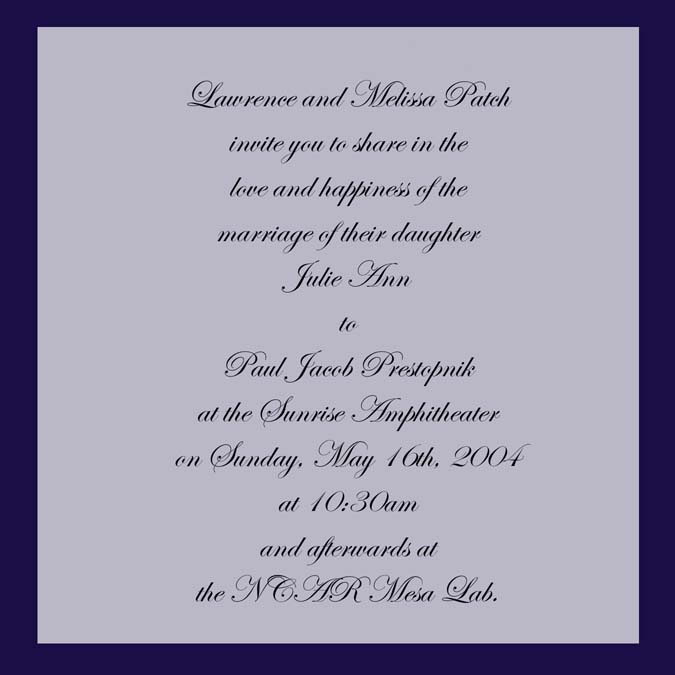
Here are some shots of what the final invitation looks like.
Invitation |
|---|
 |
Ceremony Map (front) | Ceremony Q&A (back) |
|---|
 |
 |
Reception Map (front) | Reception Q&A (back) |
|---|
 |
 |
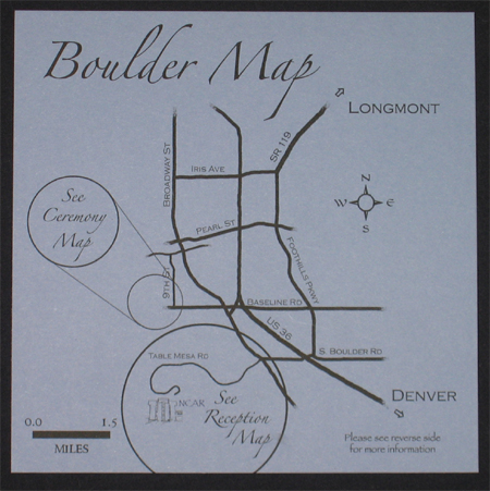
Boulder Map (front) | Boulder Q&A (back) |
|---|
 |
 |
Response Card (front) | Response Card (back) |
|---|
 |
 |
Envelope (front) | Envelope (back) |
|---|
 |
 |
Prototype Invitations
We made these two prototypes by hand, so the edges are not perfectly straight.
The actual invitations will be cut professionally. Also the letters are not
perfect. The lettering in the Copperplate font is a little off center (too much to the left),
and the lettering in Zapfino font has the very tips of some of letters cut off.
We think we can fix both of these problems. Also in real life the navy color of the
backing paper shows through the transparent paper (UV Ultra) more. This did not show up very well
in the digital photos. The back blue looks darker and richer in person.
We made them slightly different so that we could compare some features, and decide
what we liked better. One has the Copperplate font and .5 inch border of blue around
the UV ultra paper. The other has the Zapfino font and a .25 inch border of blue around
the UV ultra paper. This one also has a slightly longer wraphia ribbon (7 inches instead of 6 inches).
Both Prototypes

The next two images below show closeups of the two prototypes. The invitations are sitting in our
prototype envelope that we made. This is also made with the heavy, rich, navy blue card stock. Trish
is making a block-print stamp in the shape of a heart (based on the Jim Dine Rancho Woodcut Heart).
We plan on using this stamp to put either a red or silver heart on the blue paper that will show
through the UV ultra paper behind the text.
Copperplate font; .5 inch border; short ribbon

Zapfino font; .25 inch border; long ribbon

Font Comparison
Below are some simple mockups of our invitations. We created these so we
could compare the look of some different fonts.
Bickley Script

Carolingia(BigfooT)
Invitation.jpg)
Bradley Hand ITC

Brush Script MT

Arcitext

Copperplate Gothic

Edwardian

Papyrus

Ringbearer

Zapfino

| 
